For now, and beyond.

Our brand

Modern. Progressive. Timeless.

Since 1932, OCBC’s innovative financial solutions have enabled individuals and businesses across communities to achieve their aspirations.

Our priority is justifying our stakeholders’ trust and holding ourselves to the highest ethical standards. We also ensure our products and services go beyond simply meeting our clients’ needs and desires of the day. We are proud that the OCBC name has become synonymous with integrity, reliability and financial soundness. Through multiple recessions and major political upheavals, we have outlasted countless challenges and always flourished.

We update the brand constantly so that it remains modern and attractive, while capturing the timeless spirit of innovation and care.

OCBC progression
our logo

This new OCBC logo was unveiled on 3 July 2023.

One of the most recognisable elements of our logo is the iconic mark. It is a stylised representation of a traditional Chinese junk ship at sail, enclosed within a bold “O”. It symbolises our brave and enterprising forefathers who sailed through difficult waters from China to Southeast Asia to build homes and businesses, benefiting many.

The custom OCBC logotype embodies everything that the OCBC brand is – modern, progressive and timeliness. It is elegant and simple, with just the perfect amount of boldness.

In the same way Chinese junk ships braved new seas with fearlessness, we too, are constantly expanding beyond our borders. This sense of purposeful movement is conveyed by the three lines of the sail.

Trace the evolution of the OCBC logo since 1932

We are now on the sixth generation of the OCBC logo.

While the Chinese junk ship seldom figures in modern economic activities, it has remained at the heart of our logo throughout the years. It is part of our brand heritage. What it represents – our entrepreneurial and resilient spirit – still burns strongly, uniting us as One Group.

OUR BRAND PROMISE

OCBC brand promise

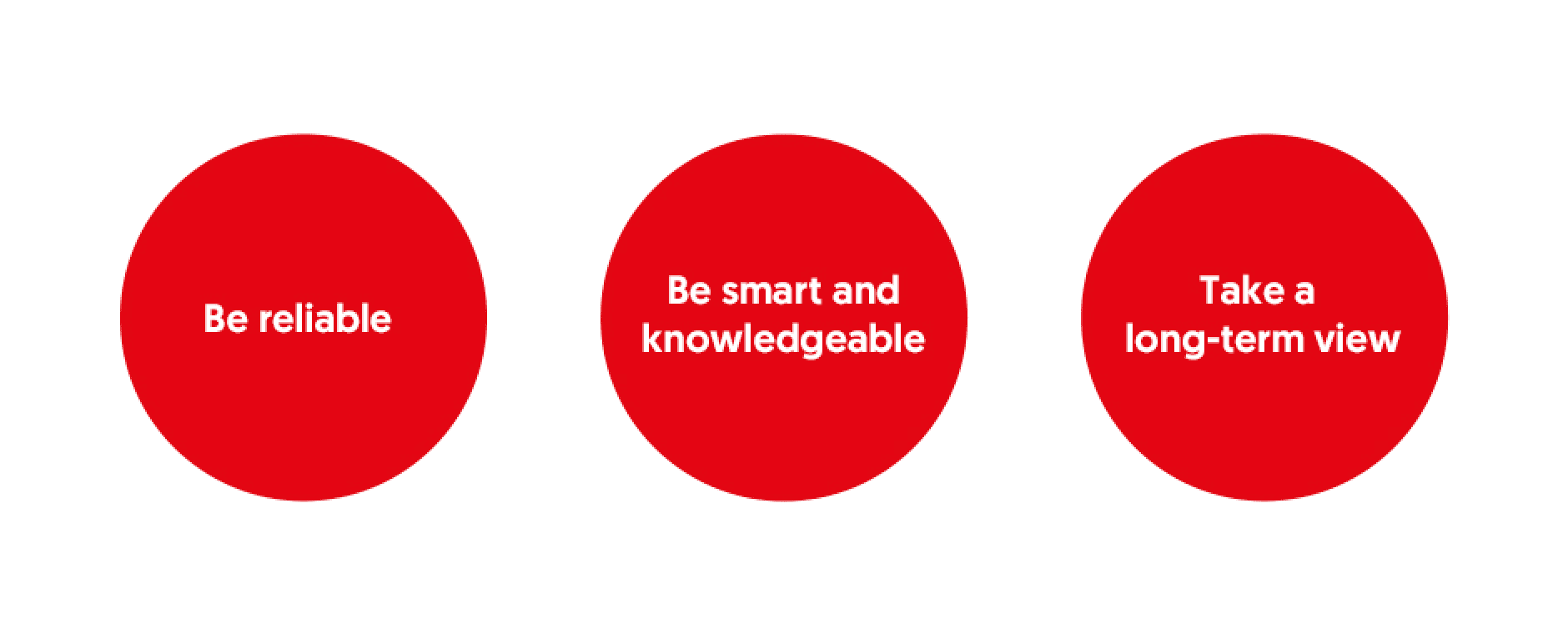
Now and beyond, we are reliable, smart and knowledgeable and take a long-term view. This brand promise cuts across everything that we do – our products and processes; channels and capabilities; customer services and interactions.

We deliver reliable services and excellent experiences; offer the most suitable financial solutions; give the most relevant financial advice and support so that we build enduring relationships.

Our duty of care, however, extends beyond the customers we serve. As a member of society, we also see it as a duty of care to nurture a sustainable world. We take the most relevant climate actions to help fight climate change; we establish the most suitable programmes to support social mobility and development; and we ensure good governance to safeguard the trust placed in us since 1932.

Our tagline

Our brand promise is communicated and expressed in our tagline “For now, and beyond”.

It reflects OCBC’s DNA of always taking a long-term view in all our dealings and investments, and our commitment not just to the present but also to the future with long lasting impact for a better world.

Anchored on our core values, we create lasting value for our shareholders, customers, employees and the community.

This is OCBC, for now and beyond.

Our colours and typography
OCBC Red

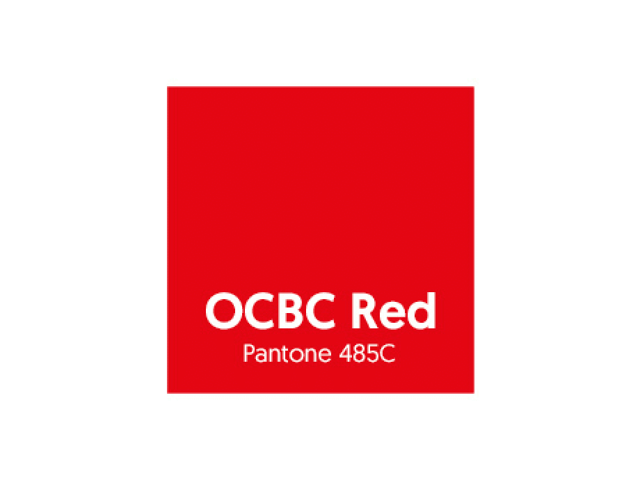
The OCBC brand has always been defined by the colour red. Strong, energetic and passionate are all qualities that red represents. It also reflects our heritage and vision of the OCBC business and people – enterprising, resourceful and effective.

OCBC Typography

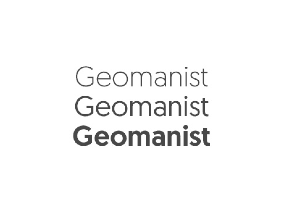
Geomanist, a contemporary and highly legible font, is used to unify the appearance of all OCBC communications.

Our brand support

Reach out to our team for the usage of OCBC’s Brand Assets.